

SOLARIS FILM COMPANY
SENIOR CAPSTONE
Proposal:
Film photography has seen an increase in popularity over the last few years. This is because people are currently learning about and inheriting film cameras, the only problem is, that most people are unfamiliar with how to operate a film camera. They also may not know how the process of film works. My solution to getting more people into film photography is a new film brand that is geared towards beginners called Solaris. Solaris is an easy to understand film company that takes pride in teaching anyone who is willing to learn more about photography. The goal of this project is to make film photography easier to understand and do. As well as make more potential users of film who would like to explore more about film photography as an art form. This will be done through package design, branding, and ads.
Target audience:
The primary target audience for Solaris is mainly younger people (14-25) who have an interest in photography and would like to learn how it works and where it came from. Solaris is also for the older generation who may miss the process of using film (45-70). The younger audience comes from people inheriting cameras and using social media. Many YouTubers and social media influencers are using film which is making it more intriguing to people from the age of 14-25 who are also the primary targets of social media.
About Solaris:
Solaris is a film company from Phoenix, Arizona that is designed and manufactured in the USA. Our company takes the feeling of film from the 70s and 80s and updates it to a modern and user-friendly design. We focus on usability and accessibility when it comes to teaching about and providing new users with film.
Deliverables:
-
Logo
-
Five packaging designs
-
Three photo ads
-
Film photography guide
-
In-store display
Objectives:
To Independently research, design and produce a logo, 5 pieces of film packaging, a store display, 3 advertisements, and a film how-to booklet.
To extensively research film packaging to create something interesting, fresh and recognizable.
To apply previous knowledge of the fundamentals of design into branding, illustration, typography, and the layout of all components.
To constantly apply self-critique and critique from others during the design process in order to create a working and successful brand.
To create a recognizable brand identity for Solaris.
To create an identity that stands up to current packaging design standards.
To appropriately present this project in the formats that best fit each piece. To have perfect craft in all of the handmade deliverables.


RESEARCH
When researching to create Solaris I wanted to make a completely new look for film photography. Currently, film has a very outdated look and feel which can be off-putting to new and younger users. To determine what needed to change I took a look at films' top competitors. As well as a few smaller companies. This research showed me that one of the biggest roles that made film feel outdated was its packaging.
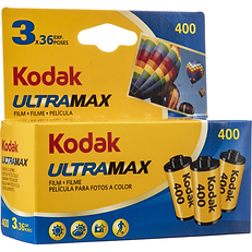
Many film companies have barely updated their film packaging in the last few decades. Their packaging also felt very overwhelming in how much redundant repetitions of information is on every side of the boxes. After doing this research I decided that it would be necessary to make a big change. I started to experiment with the shape of the boxes, an easier to understand system of information, and the use of stronger bolder colors.
PROCESS WORK
LOGO
The process of creating Solaris started with doing sketches for the logo that combined a sun and aperture blades. Once I got something that worked for my vision of the brand I moved to the computer and tried dozens of different variations of the logo.


PACKAGING
The next deliverable I worked on was the packaging. I took a look at existing film packaging and decided what needed to be improved upon. My first idea was to just try adding bold color and more design elements. I decided that this was not a big enough change which led me to experiment with make different shapes for the boxes. I tried hexagons, pentagons, and triangles. I ultimately ended up on triangles. This gave me the ability to create something new and exciting all the while making it more modern, intriguing, and cheaper to produce due to the use of less material.


STORE DISPLAY
Next up on the list was to create a store display to draw attention to the product and brand in the store. I thought about multiple ways to display the film such as stacking it into a pyramid, a sign with the film underneath it but, what I ended up doing was making an oversized replica of one of my film packages, the 110 film. I created a 110 film box that is just under two feet tall. This will sit either on the floor or counter of a store where it could either have actual film next to it on a shelf or even stacked on the flat surface of the top of the box.


PHOTOGRAPHY GUIDE
The fourth part of the project that I worked on was the Film photography guide. This is a 20-page book that consists of how film works, the basic workings and settings of a camera, information about different film sizes, what to do and what not to do when shooting film.


ADS
The last deliverable of the project that I did was the magazine ads for Solaris. I made a series of three ads that communicated the same message but with a different style of art being shown. These consisted of stone sculpture, drawing, and painting. The point of these ads is to get the message of film photography as an art form across to potential customers of the brand.


FINAL COMPONENTS
LOGO

PACKAGING


STORE DISPLAY


ADS
